As big data changes the way we conduct business, how we communicate that large volume of information to the public will also change, said experts at the SMU Communications Management Colloquium.
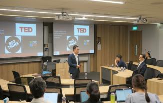
Above: SMU Assistant Professor Mark Chong presenting his research work at the SMU Communications Management Colloquium that took place in SMU in Nov 2019.
By Lim Zenghao
SMU Office of Research & Tech Transfer – In a world where almost everything can be tracked and measured, from our thoughts on Twitter to our steps in Fitbit, we are awash in an avalanche of data that spans almost all aspects of our lives.
Though a goldmine of potentially useful business information, the usefulness of this data has always been limited by our capacity to make sense of it all. And that’s where data science comes into play – it enables us to better understand ourselves and our behaviour through the vast sea of information that we churn out.
At the Communications Management Colloquium held at the Singapore Management University (SMU) on 18 November 2019, communication experts showcased just how much we can learn by looking at TED Talks and weather forecasts through the lens of big data.
What makes for a rousing speech?
Everyone is familiar with that rousing feeling that comes in the wake of having listened to a particularly engaging speaker, and of coming away from their words in a highly motivated mood. But what, exactly, makes for a successful motivational speech? It would seem that the answer, much like the takeaway effect of the speech itself, is so subtle as to be almost ephemeral.
Surprisingly, there has been no text analytics-based study of what makes speeches engaging until the work of SMU Assistant Professor Swapna Gottipati and SMU Associate Professor Mark Chong.
“If these multimedia event companies and talk organisers can get a better handle on the kinds of content that resonate with their audiences, this knowledge can empower the speakers and also translate into more sustainable business enterprises,” Professor Chong said.
To see what patterns can be found in successful motivational speeches, the pair went about analysing almost two decades’ worth of transcripts of TED Talks – which, as far as rousing motivational speeches go, seem to have things down practically to a science.

Above: SMU Assistant Professor Swapna Gottipati sharing her research findings at the SMU Communications Management Colloquium.
Professor Gottipati added that the organisational framework of TED Talks was particularly useful for their analysis, not only because all the talks were already transcribed – thereby making analysis easier – but also because the documentation of each talk includes feedback and comments from the audience.
In particular, they looked at the specific difference between ‘inspirational’ and ‘persuasive’ talks and topics of interest for engaging talks based on some 2,400 transcripts culled from TED Talks delivered between 2006 and 2017.
Using natural language processing techniques, the duo found that the common key to an inspirational or persuasive speech – or any successful TED Talk, for that matter – is a nuanced storytelling structure that, like any successful movie or novel, knows what emotions to touch on and when to do so.
They found that both persuasive and inspirational talks involve rising story arcs, with positive emotions building to a peak near the end of the speech. Inspirational talks tend to be more emotional throughout their duration, tugging on the audience’s heartstrings so that they come away with a generally positive feeling. In contrast, persuasive talks often appeal to the audience’s feelings of anger and risk in order to spur them into action before ending on a high note with positive emotions.
Overall, engaging talks usually touch upon evergreen topics such as education and the environment, or trending topics such as artificial intelligence and blockchain, the researchers discovered.
What’s up with the weather?
Surrounded as we are with so much data that needs to be taken in, one of the most ubiquitous and urgent data visualisations that we encounter on a regular basis is that of weather forecasting – especially when it comes to unfolding phenomena that are potentially life-threatening, such as hurricanes.
While SMU Assistant Professor Roh Sungjong was in the United States pursuing his doctoral studies in 2012, news broke out about Hurricane Sandy – the strongest, deadliest and most destructive cyclone to hit the US that year.

Above: SMU Assistant Professor Roh Sungjung presenting at the SMU Communications Management Colloquium.
Cycling through the news channels, he noticed that some forecast maps plotted Sandy’s expected location as a series of dots spaced at 12-hour intervals, whereas other maps used 24-hour increments. Visually, shorter intervals made for a more crowded segmented line, since there were more dots spaced closely together.
How does this affect people watching the forecast, Professor Roh wondered? A quick call to the US National Weather Service drew no conclusions. “Basically, their response was it is kind of an innocuous decision [whether to use 12-hour or 24-hour forecast maps].”
Not one to let a good line of inquiry fall unanswered, Professor Roh ran the 12- and 24-hour forecast maps by a large set of human evaluators, via Amazon’s Mechanical Turk service, and came up with some surprising results.
While it may seem that a 12-hour forecast is more useful because it gives viewers more information to work on, the tighter spacing between dots gave the optical illusion that the cyclone is travelling slower than it actually is. Conversely, the large gap between points on a 24-hour forecast map made it seem that the cyclone is travelling faster than it actually is.
This variance in perception, an optical illusion, affects not just the public’s immediate response to impeding disaster but also their understanding of long-term risks. This, in turn, impacts consumer decisions such as long-term disaster preparations and insurance plans.
Moreover, because data visualisation is inescapably becoming an essential tool for conveying complex information to the public, organisations must be more circumspect and cautious in its use. “One seemingly innocuous attribute of your visual display of information can affect human judgement and choices,” Professor Roh said.
The changing nature of work
Capping off the colloquium, Professor Gerard George, Dean of the SMU Lee Kong Chian School of Business, underscored the need to unite data science, management and the humanities. Big data is changing the way we conduct business, and in turn will also affect the way we communicate that large volume of information to customers, he said.
“The ubiquity of data is making us rethink the way we do our jobs,” he said. “The way we do workplaces and the design of work [itself] will change. How we think of issues like identity and meaning and purpose within jobs will change,” he concluded.
Back to Research@SMU Nov 2019 Issue
Image credit: Lim Zenghao